1. Margins: generous margins on all four sides.
- the larger the layout, the bigger the margins
- thumb space
2. Columns: Establish columns as guides
(no. of columns depends upon layout)
- vertical columns
- two columns are usually adequate
- make sure the alley of negative space separating the two columns isn't too small or big
- you need enough space to keep columns visually separate but still cohesive
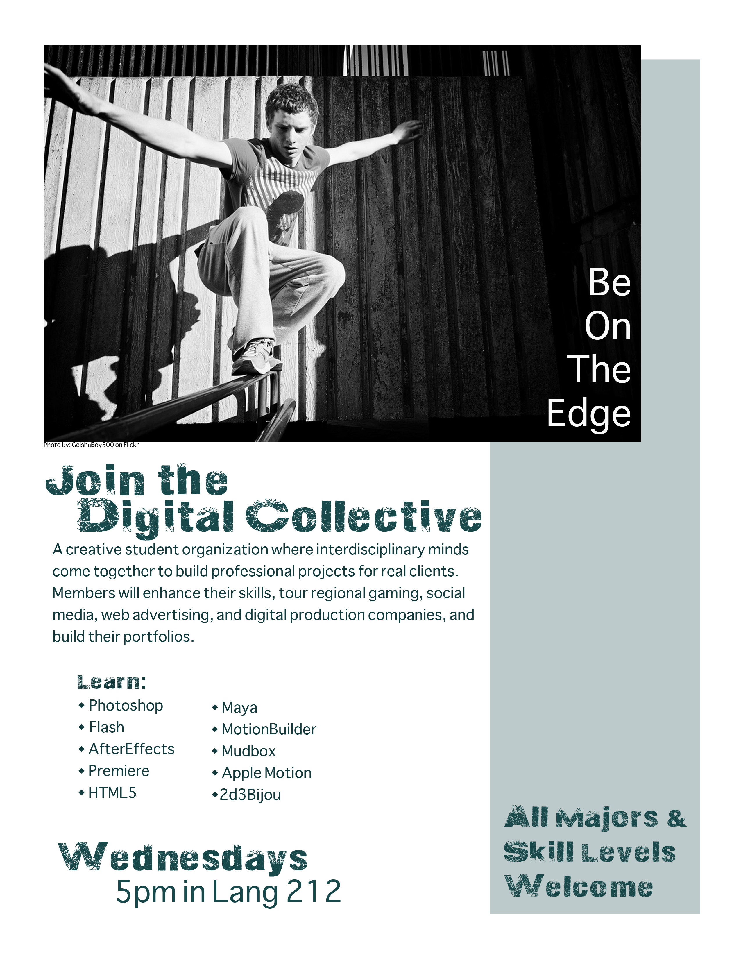
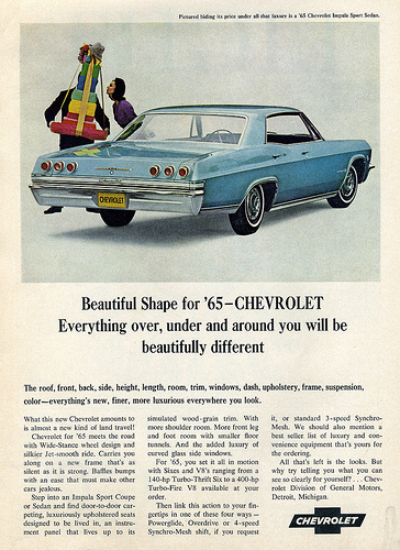
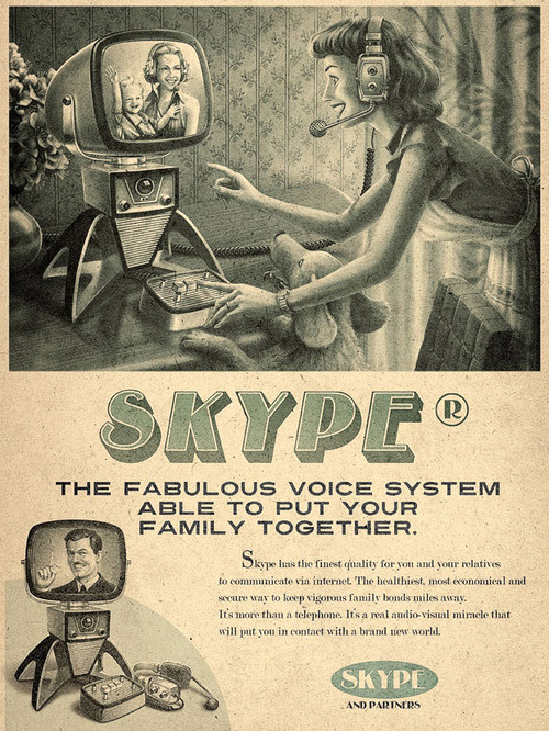
3. Visual: Position the visual at the top of the layout
4. Cutline. Snuggle the cutline under the visual.
- flush left and ragged right, directly underneath the visual
- use the same font you choose for either your headline or your body copy
- set the cutline somewhere between 9 and 11 points
5. Headline: Position the headline under the cutline.
- give it visual weight--make it big
- choose a font that symbolically goes with your design concept
- no script-style fonts
- if you can't get the copy in one line, then let the copy tell you when to break.
- only 2 fonts are allowable
6. Copy: Position the body copy into columns under the headline.
- Keep the headline and the lead together
- put your copy in columns.
- if your copy is too short to fill every column, then fill a column with negative space
- it's okay to leave a column empty
- aim for legs between 2 and 10 inches long
- set your copy between 9 and 11 points using a transparent (easy to read) font
- shoot for an average of 6-12 words per line.
- text should be flush left, ragged right
- don't indent the lead under a headline
- make sure the top and bottom of each leg looks elegant.
7. Tags: If applicable, place tags (logo, contact info, etc.) in the bottom of the right corner.
- if nothing else include the logo and the URL
- place tags in lower right corner
- use one of your 2 fonts, and make sure it's readable at a small point size.
|
 |