"o·mis·sive"
[oh-mis-iv]: adjective;neglecting;
leaving out.
"soil·age"
[soi-lij]: noun; grass or leafy plants
raised as feed for fenced-in livestock.
|
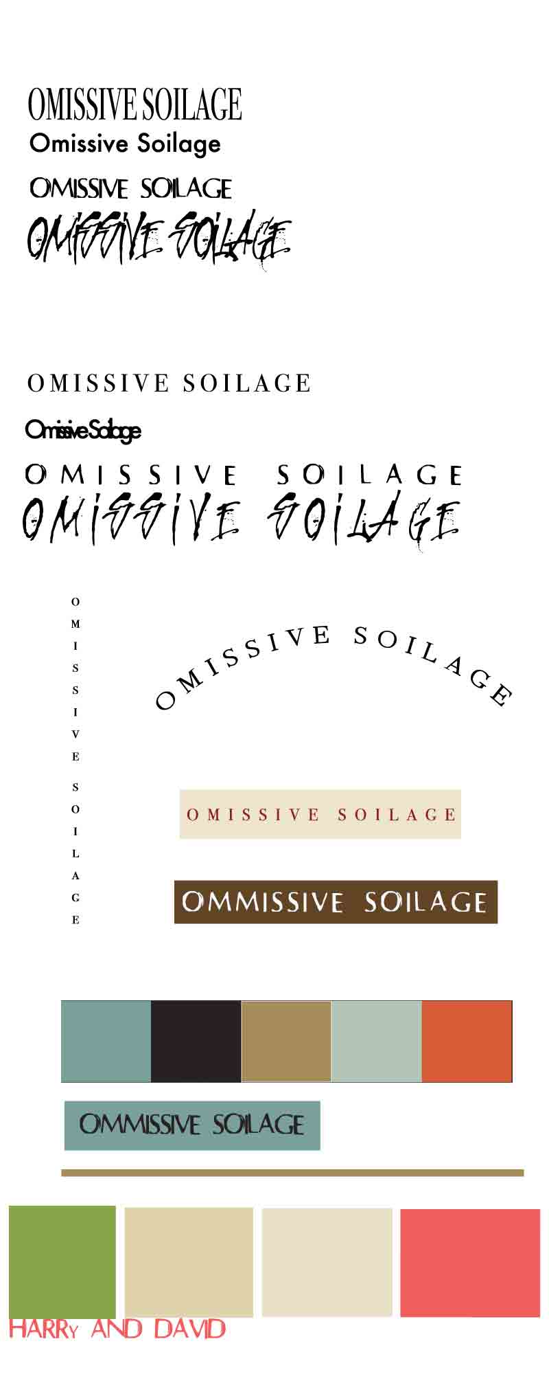
TYPOGRAPHY
1. PICK WORDS: Randomly pick two words from Dictionary.com/Word of the Day archive, like “omissive” and “soilage”...
2. DOWNLOAD NEW FONTS: Go to DaFont and select and download 2 very VERY different FREE fonts...Save to your desk top.
Then load the 2 fonts into your Font Book: Go to Applications/Font Book and select File/Add Font. The new fonts will immediately appear in all your applications with a text tool (Word, Photoshop, Illustrator, etc).
NOTE
: SINCE WE CAN'T DOWNLOAD DAFONT ON OUR ITTC COMPUTERS THIS STEP IS OPTIONAL
3. APPLY FONTS: Create a new PHOTOSHOP document with a WHITE background. Start with 800 X 2000--you can change the "Canvas Size" as you see fit later: Image/Canvas Size.
Now apply 4 separate fonts to 4 separate word pairings--each on a separate Photoshop layer:
a. Type your 2 words in BLACK using a 36 font size, and apply a classic serif print font to the first word pairing.
b. Type your 2 words again on a second layer, and add a classic screen font.
c. Type your 2 words again on a third layer, and add your first newly downloaded font.
d. Type your 2 words again on a fourth layer, and add your second newly downloaded font.
NOTE: LAYERS ARE IMPORTANT: EACH FONT NEEDS TO BE ON A SEPARATE LAYER! "CONTROL J" INSTANTLY DUPLICATES A LAYER OR GROUP, WHICH MAY SAVE YOU SOME TIME (("Command J" for a Mac)
4. ORGANIZE FONT LAYERS:
Name each layer after the font you chose for that word pairing (E.G., Layer 1 = BODINI; Layer 2 = FUTURA).
Duplicate the first 4 font layers: highlight all four layers in the Layers panel, and duplicate them using one of the 3 methods below:
- With all layers highlighted, select Layer/Duplicate Layer. The four new duplicated layers will first appear directly on top of the first four original layers. Drag the new 4- layer selection (within the Photoshop image itself) down and into place.
- Working solely in the Layers panel, grab the highlighted layers and drag them onto the “new layer” icon at the bottom of the panel.

- Hold down the “Alt” key, put your curser on the selected 4 layers (within the Photoshop image itself) and drag down to reveal an immediate copy of the 4 font layers...bring these new layers down to their new place below.
Group the first 4 font layers: Select all four layers, "Control G" ("Command G" for a Mac)
Give Group 1 a name: “NORMAL TEXT”
Give Group 2 a name: “TRACKING AND KERNING”
Grouping helps you organize elements within your Layers Panel!
5. APPLY TRACKING AND KERNING: Adjust the TRACKING (adjusts the space between a range of type) and the KERNING (adjusts the space between a pair of characters) of each word pair in the TRACKING AND KERNING Group. By varying the space of letters, try to achieve a feeling, mood or sense of motion. To fit everything in on your document, you may have to reduce or enlarge font size.
6. APPLY VERTICAL AND WARPED TEXT: On separate layers, try your favorite word-pair and font combination as:
- a vertical stack (note that not all letters were designed to sit on top of each other)
- a warped arc
COLOR
1. 2 LOGOS: Apply color to your dictionary words!!!! The idea here is to put your favorite word pair/font combination on top of a shape layer, and choose colors for both text and shape. Draw a rectangle box with the Shape tool to create a Shape layer (you'll decide on color later). Then add a text layer on top using your favorite word pairing + font combination. Finally, select HEX colors for both shape and text to create a beautifully contrasting color combination (Use the Colour Contrast Check as your guide). NOTE: to re-enter the color palette for the Shape layer, double click on the "Shape" icon in the Layers panel as needed. Let the words you have chosen be the “personality” for the color combination (in effect you’re designing a logo of sorts).
CREATE TWO LOGOS.
2. KULER FUN: Go to KULER (kuler.adobe.com/) and search for a pre-made theme that matches the "personality" of your two words.
Once you find "the one," grab a screen shot of the 5-color theme and bring the image into your PS document.
Screen Shot Directions: MAC: hold the Shift, Command, and "4" keys simultaneously and drag to select; PC: Press the "Print Screen" key on your keyboard). An alternative for PC users: search for the "Snipping Tool" in your applications and drag to select the portion of the screen,
3. EYEDROPPER FUN: Pick two contrasting colors from your KULER theme, and build a new logo. Next, pick a third color from your theme and create a Brand Bar (it's just another Shape layer). Lookin' good.
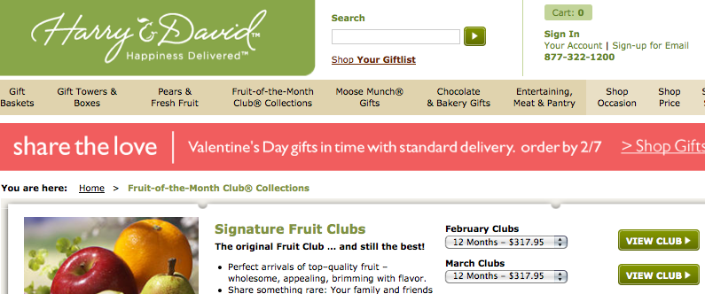
4. WEBSITE COLOR THEME COPY FUN: Select one of the websites below, grab a screen shot, bring it into PS, and recreate the website's color scheme in your PS document. To do this, create 4-5 shape layers (depending on how many colors are in your theme) and apply the Eye Dropper tool to re-color each Shape according to your website's colors. Write the name of the website underneath your recreated color theme.
HAND IN: A PHOTOSHOP DOCUMENT (PSD FILE) IN YOUR DROP BOX WITH ALL OF THE ABOVE COMPLETED. DUE: FRIDAY, FEB. 3
|